Designing the Frame Story Logo
B
Britney Winthrope
December 13, 2025
Sometimes the best creative work happens when you limit your options and pay closer attention to what's already in front of you.
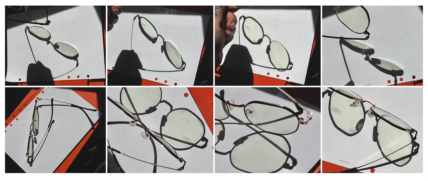
When I got the brief to design a logo for Frame Story, I'd just received my first glasses prescription. I started taking reference photos and really examining frames. I noticed things I'd never paid attention to before: the way shadows fell across the lenses, the negative space created by the bridge, the interesting geometry of something people wear every day but rarely examine closely. Those observations became the foundation for my concept development.
Frame Story is about something bigger than just gaming. For the founder Anthony, the games he grew up playing were his life stories. The literary device of a frame story - a micro story that hints at themes of a larger narrative - became his inspiration for building games that help people understand the stories in their own lives. That concept became my anchor for creating a visual identity that could carry that weight.
Starting with Analog

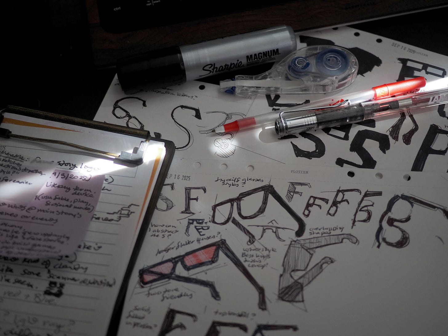
To connect my love of sketching on paper and my production work, I made the choice to begin with ballpoint pen, Sharpie, white-out, and sticky notes. There's something valuable about embracing a less controlled process, about letting your hand move before your brain gets too involved in perfecting things. Digital tools are precise and forgiving, but they can also make you too careful too soon.
The analog process meant accepting ugly stages. Sketches that looked awkward or unbalanced. Ideas that seemed promising in concept but fell apart on paper. Those moments are uncomfortable, but they're where creative surprises live.
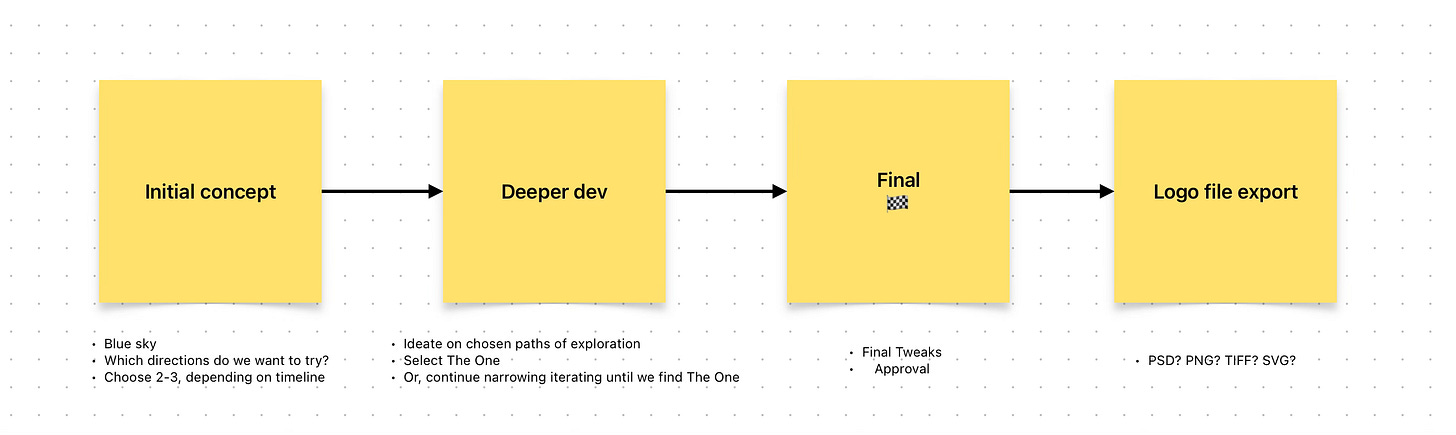
I structured the work across five stages to keep things moving forward:
• Stage 1: Clarified timeline expectations with the team
• Stage 2: Blue sky exploration - throwing everything at the wall
• Stage 3: Choosing 2–3 concepts to develop more deeply
• Stage 4: Refining the chosen concept through iteration and feedback
• Stage 5: Vector cleanup and final file exports
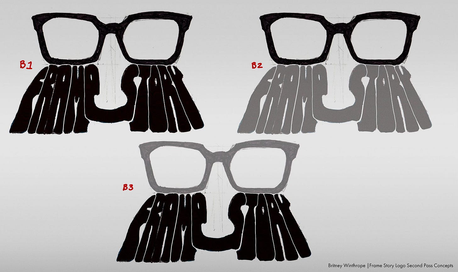
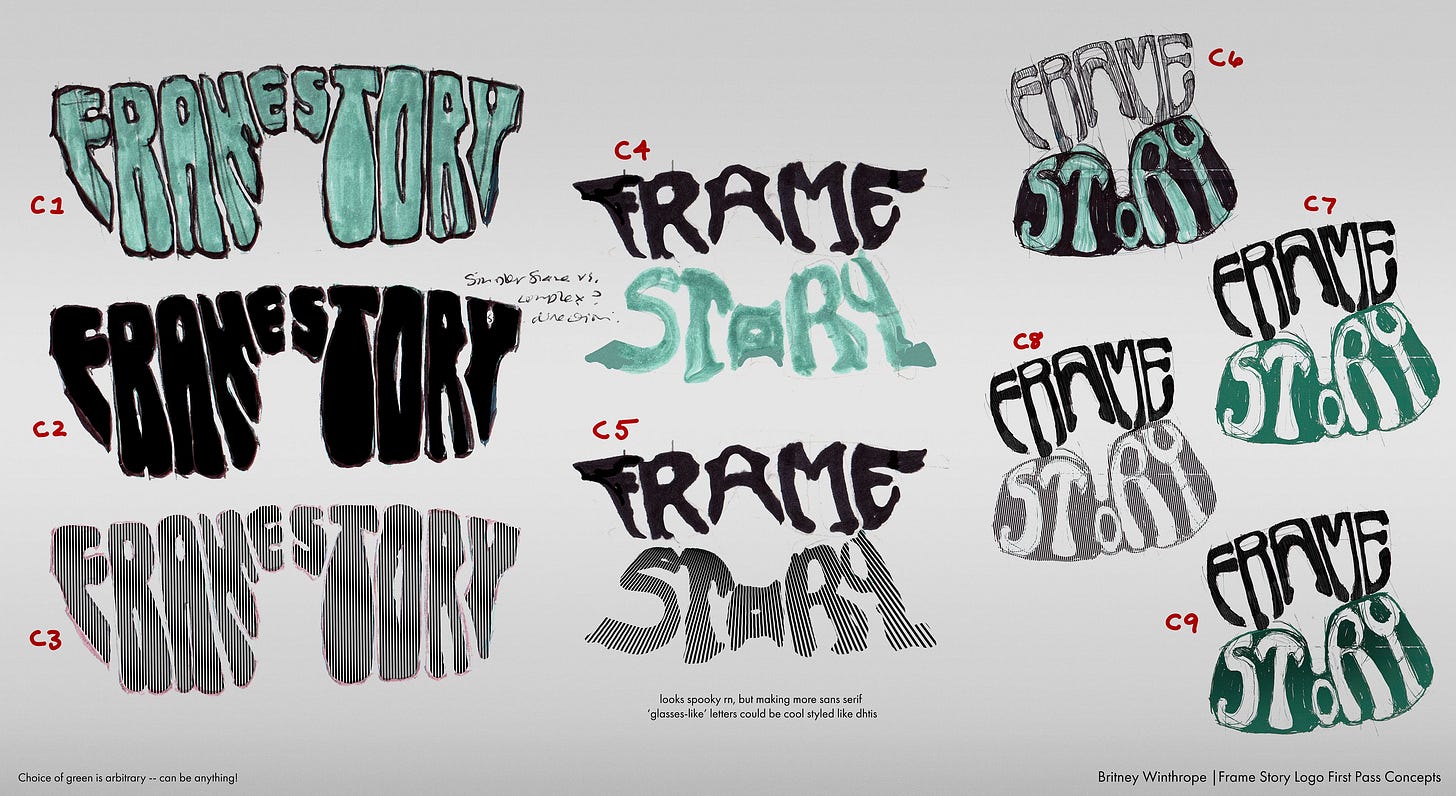
Exploring Directions
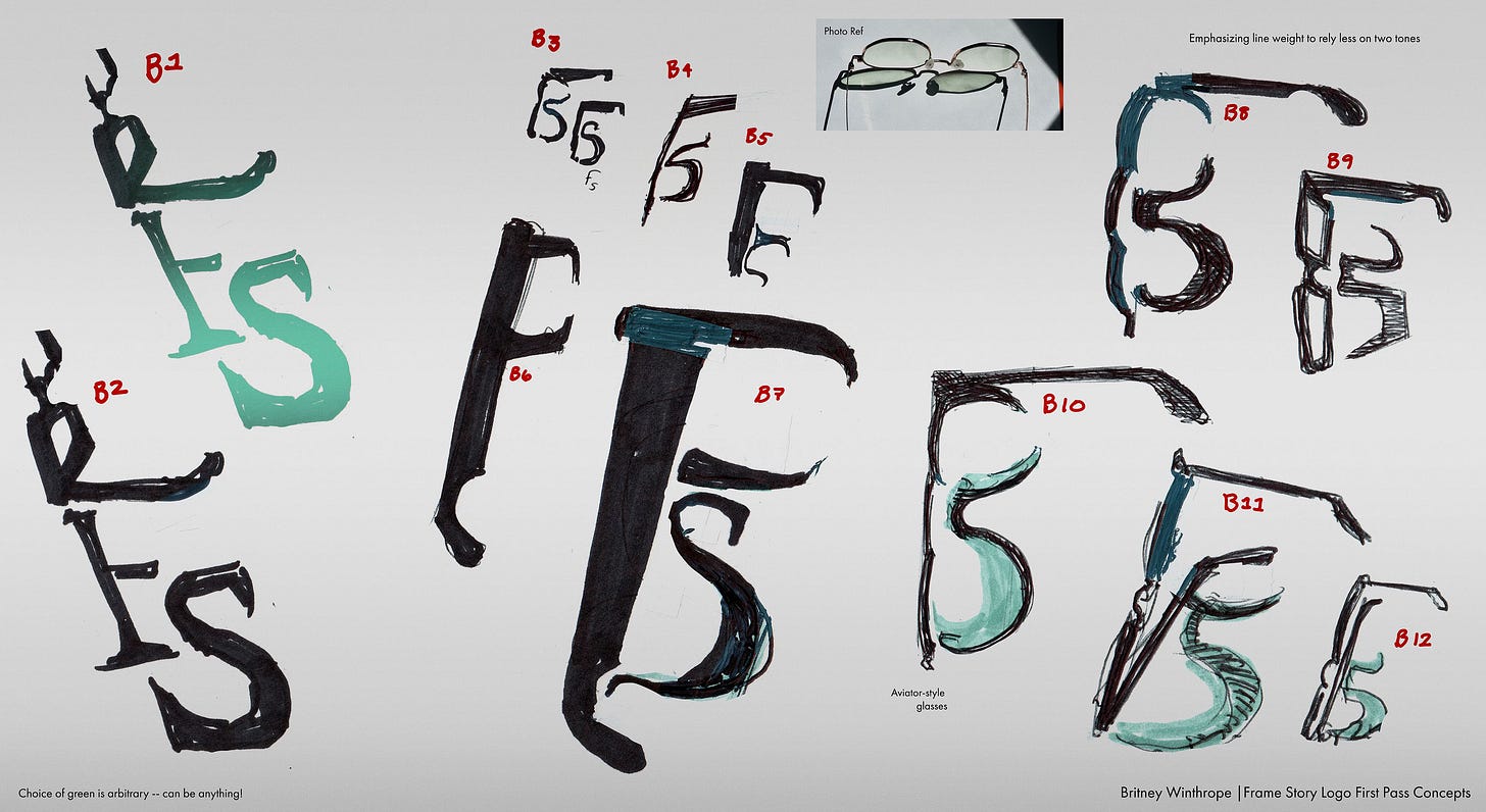
The goal was to find a duotone look that could help denote each letter while maybe playing with the shapes of glasses and their reflections.
I explored several directions during ideation. One was blocky and geometric - I used a thick chisel Magnum Sharpie and tape-based highlighter to create negative space that suggested lenses without being too literal. Another went more calligraphic, abstracting the forms so the glasses themselves suggested letter shapes.
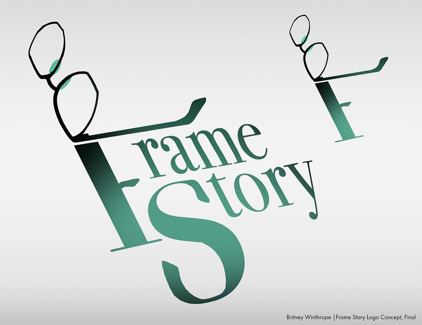
The Final Logo Concept
The direction that worked was more typographic. A pair of glasses where the left post forms the upper part of a capital F, connected with a capital S. It allows for both a full logo with the company name and a simpler icon version you can use anywhere.
When I shared it with the team, the response was enthusiastic. Anthony loved it. That moment when a client sees what you've been working toward and it resonates with them is always satisfying.
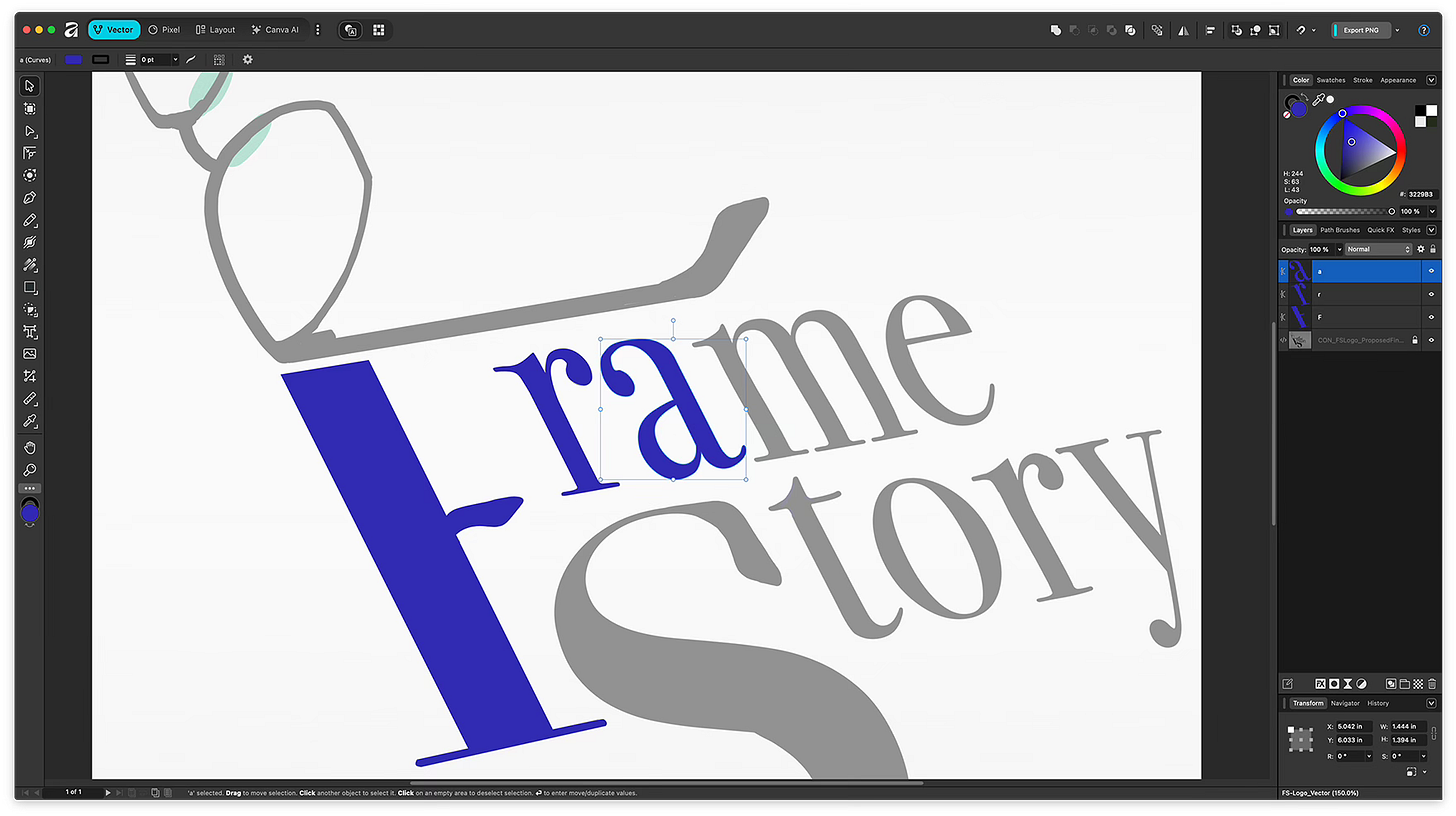
Learning Affinity Designer
Once the concept got approved, I needed to translate those rough sketches into clean vector artwork. I decided to use Affinity Designer, which meant learning a new program while working toward a deadline. I exported the final logo in multiple formats - SVG, EPS, and PNG - to give the team flexibility for different use cases.
The Handoff and Collaborative Refinement
About a month after I delivered the approved vector files, I needed to step back from the project. After I left, the art lead Will identified something subtle: the lower curve of the S in "Story" wasn't following the same angle as the rest of the logo. I passed the final touch-ups to Reeves, who was able to step in and bring the logo across the finish line.
This reflects how design actually works on game projects. Multiple people contribute, fresh perspectives catch things you might have lived with too long to see, and projects evolve through handoffs.
What I Learned
This project reinforced the value of analog-to-digital workflows for creative discovery. Accept imperfect stages - they're not failures, they're part of the journey. Learning Affinity Designer mid-project expanded my toolkit. And working on the Frame Story logo became a form of creative cross-training.
I'm excited to eventually see the logo in the final game. The creative energy that team brought to the project was inspiring, and I'm grateful I got to be part of it.